B2B SaaS platform for care homes
Redesigned a SaaS CRM integration platform and marketing website for European care-home providers, improving usability and onboarding. Research-driven redesign increased in-app CSAT by 12% (user surveys), while the marketing website redesign improved Book Demo conversion by 6.5%. 🏆AWARDS: • #5 in Deloitte Technology Fast 50 Ireland (2025) • Tech4Good Service Award, Technology Ireland Industry Awards (Ibec), 2025 • Sifted 100 (UK & Ireland, 2026) – Top 100 fastest-growing startups
Industry
Healthcare
Role
UX/UI designer

THE PROBLEM
Care homes gave mixed feedback: the features worked well, but the design felt unfinished and hard to use for new users. The landing page also underperformed — the message was unclear and the design weak. The goal was to find key issues and improve both with small, targeted changes.
RESEARCH
Working with the client, his business partner, two developers, and me as UX/UI designer, I reviewed the product and landing page against existing user feedback, and benchmarked against competitors — Birdie, CareDocs, Nourish, GoIcon, and Person Centred Software.
⭐ Key insight: the product worked well but lacked clarity and visual polish, which made it harder to use and understand.

USER PAIN POINTS
Users often struggled to use the platform in their daily work. Even though it had all the needed features, it took extra effort to find and scan important information.
Text and tables were hard to read, making it difficult to quickly scan information.
The interface felt outdated and unclear, and the mobile experience made some tasks harder to complete.
Outcomes
Identified key usability and navigation issues in the product
Highlighted lack of visual clarity and hierarchy in the interface
Defined weaknesses in the landing page messaging and structure
DESIGN SOLUTIONS
Within a 3-month design and development timeline:
UX improvements across key screens — fixing usability issues and increasing contrast for CTAs and text
Table interface redesign — improving structure, spacing, and hierarchy for easier scanning
Landing page redesign — clearer structure, visual storytelling, and feature breakdowns with product screenshots
Activity calendar improvements — exploring more intuitive scheduling and activity management
Design Iteration & Improvements
I increased contrast and improved page structure across key screens to make content easier to read and scan, documenting all changes clearly for developers.

Tables & Mobile Experience Improvements
Tables were redesigned with better spacing and typography for easier reading, and the mobile version was simplified with clearer layouts and touch-friendly elements.

Activity Calendar Improvements
The existing calendar worked well and users were familiar with it, so instead of a full redesign, I explored a Google Calendar–inspired layout to make scheduling more intuitive without breaking familiar patterns.

Sales Landing Page & Product Extensions
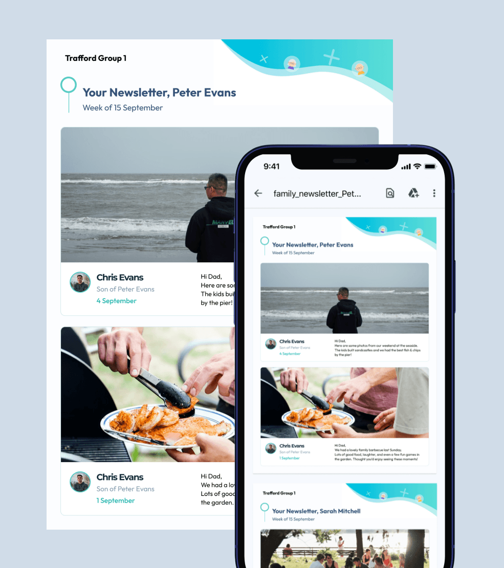
I redesigned the sales landing page to make the product clearer and more convincing, created a newsletter template for client communication, and contributed to new features including a tablet version, a TV interface for residents, and an AI assistant concept.



PROTOTYPING & VALIDATION
Keeping the Original Calendar
A Google Calendar–inspired redesign tested less comfortable for users than expected during validation, so we kept the existing calendar and improved it with small changes instead of replacing it.

Menu Page Update
The Menu page follows the same familiar structure as the calendar, letting users check daily meals and navigate between days without confusion.

Feature-Focused Website Content
We restructured the website into a clearer product story with dedicated pages for each key feature. 🚀 Results: +10% Feature Page Engagement • +6.5% Book Demo Conversion • +14% Session Duration (based on post-launch metrics shared by the client)

FINAL DESIGN
The final product improved usability, clarity, and visual consistency while keeping core functionality unchanged.
The interface includes:
improved readability and clearer structure for easier navigation and daily use;
redesigned tables, key screens, and landing page for a more consistent experience;
redesigned 30+ screens across desktop and mobile for the SaaS platform;
created 20+ website pages for desktop and mobile in two languages.


